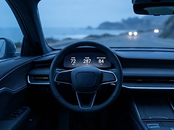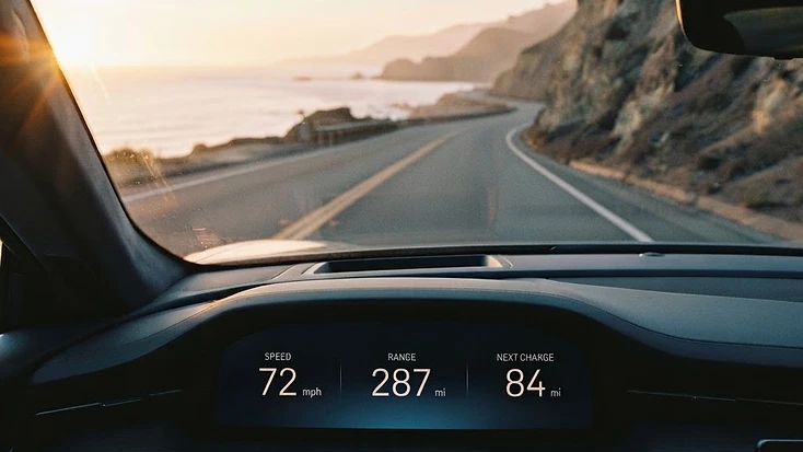
Concept study. Speculative exploration. Not client work.
The problem
Electric grand tourers changed what a car is, but not what a car cabin does. Four hundred silent miles, no gearshift, no engine note, no mechanical drama: the cabin is now the product, and the industry filled it with screens.
The result is a documented failure. The AAA Foundation measured common touchscreen tasks in current vehicles at 24 to 40 seconds of eyes-off-road time. The accepted safe glance is two seconds. A modern EV cabin is, in practice, a life-safety surface dressed as a consumer app, and it is asking drivers to leave the road for the length of a city block to adjust a climate fan.
Range makes it worse. Range anxiety is one of the top three cited barriers to EV adoption in every major survey, from Deloitte to McKinsey to AAA. The industry's answer has been to bury the answer inside a menu, drawn as a number with no relationship to where the driver is going. The single most important question an EV driver holds, "will I make it to a charger," is treated as a trivia fact rather than as the core of the interface.
Meridian reacts to a specific set of cabins: the Mercedes EQS Hyperscreen, which rewards attention with more attention; the BMW i7, which layers media over motion; and the general pattern, across Rivian, Polestar and Tesla, of offering more the faster the car goes. Each is competent. Each is, in the frame of this study, wrong.
The premise
A grand tourer owes its driver a specific contract: long, quiet distance, taken seriously. Meridian is the cabin interface that contract deserves, designed not as a screen with features but as instrumentation with taste. Speed, always. Range and route, one beat. Media and comfort, never in motion without a glance's worth of hierarchy. The car speaks once, in one voice, across navigation, energy, media and assistance, because a cabin that changes accent between its systems feels like a committee.
The principle
The governing discipline is glanceability. A driver interface is a life-safety design problem that pretends to be a UX problem, so every piece of information is budgeted by the seconds it may claim from the road.
From that discipline comes the tempo rule, the study's central idea: interface density is inversely proportional to velocity. The faster the car goes, the less the interface offers. This is the opposite of every screen-on-wheels shipping today, and it is the single decision that separates Meridian from a redesign of an infotainment system.
What was rejected: the infotainment mindset, the idea that the cabin is a lounge with a dashboard, and any feature that rewards attention with more attention.
The exploration
The concept was developed as an information hierarchy, a set of core components, and a tempo rule that governs them.
The three core components are the speed instrument, the range-and-route field, and a single assist surface. The speed instrument is always present and always first. The range-and-route field treats range as a landscape rather than a number, an instrument read the way a pilot reads fuel, with the next charging stop drawn as part of the horizon rather than as an interruption. The assist surface is the only place the car ever speaks twice, and only when the road demands it.
The signature moment is the range field. Range is the question an EV driver actually holds; Meridian answers it as geography. The next charger is not a detour, it is part of the road ahead, drawn into the route the driver is already reading.
The fix
The delta the study proposes is simple to state. Today, an EV driver leaves the road for tens of seconds to reach information that is, at highway speed, the difference between arriving and stopping. With Meridian, the same driver reads the same information inside a two-second glance, and the interface itself retreats as the stakes rise.
The cabin becomes quieter the faster the car goes. Range stops being a number and becomes the road. The car speaks once, in one tone, and only when it has something worth a glance to say.
Artifacts: the information hierarchy diagram; the glance-time budget as a designed table; the tempo rule stated as a system principle.